I’m truly obsessed with Graphical User Interfaces (GUI). I think one of the things I love most about learning a new console is pouring over the details of how the team of engineers laid out all of the possibilities. Recently, I was tasked with the job of designing and programming a small film studio lighting rig. The catch? The rig is intended to be operated by the Director of Photography. (Covid restrictions asking that the fewest people needed be in the room.) The DP, reasonably, neither knows nor cares how the console works. So the job was to lay out all the options he might need for a typical shoot, but not mire him in details and decisions that require him to be a programmer.
Let me say now that this is not a tutorial, but a use-case scenario. I don’t present my work as definitive or anything like that. I think my approach is a good solution to a series of problems and it might be helpful or inspiring for any interface design issues you may have. I also welcome Monday Night programmers offering opinions on how they would have done it, have done it, or any reason-based challenges to my approach.
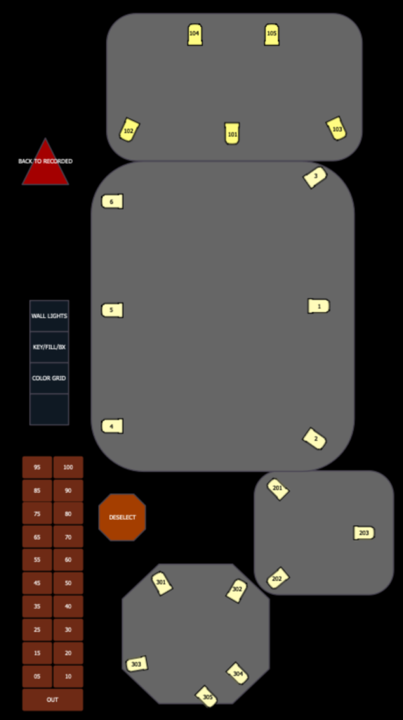
The room is a white-walled structure (a series of challenges all by itself) with four systems of lighting dedicated to layering color on the walls. There is a cyc-like wash system, a gobo system, an uplight system and an LED tape system embedded in the kicker of the whole structure and in three panels central to the room. Arguably most important is the (conceptually) separate system of Key/Fill and Back lighting (let’s abbreviate to KFB, please) for the DP to light the subjects. All fixtures are color mixing LEDs.
Starting with the critical system, a quick conversation with the DP let me know they wanted all key/fill/back lighting to be at 5500k. An easy directive to start with. The fresnels in the system have console-controlled zoom, so after focus, the first thing I did was make a home preset that took all the KFB lights to 5500 and zoomed them to suit the focus. This insured the DP would never (hopefully) have to dial zoom value and never see a light outside their desired color temperature.
Next was to give the DP an interface they found approachable and supportive. I decided to create a multi-tabbed magic sheet, since the DP felt they would find a graphic interface easiest. I laid out four tabs on the left (macros that replaced the magic sheet, of course.) Since the room is split up into four mini-stages, I created four shapes to represent each space on a new tab. Within each stage, I laid out the KFB lights in a way that made their purpose clear and how they worked for each stage. This was deemed best rather than confuse anyone with showing the lights where they actually are since the systems overlap physically. Accuracy and clarity are not the same thing. I then added intensity palettes in 5 point increments for the DP to set levels and finished with a Deselect macro and a Back to Recorded macro (Sneak Enter) in case any cues were ever in the background.
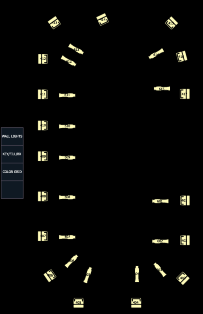
Next goal was to make the wall fixture magic sheet- easy and unremarkable since the DP never intended to view it.
Finally, I needed to make a magic sheet to trigger the wall decorative lighting. After pondering, I decided to do a magic sheet inspired by every color grid we’ve ever seen for a busking rig except it is laid out vertically since the second monitor for the system is vertically oriented- exactly like the room.
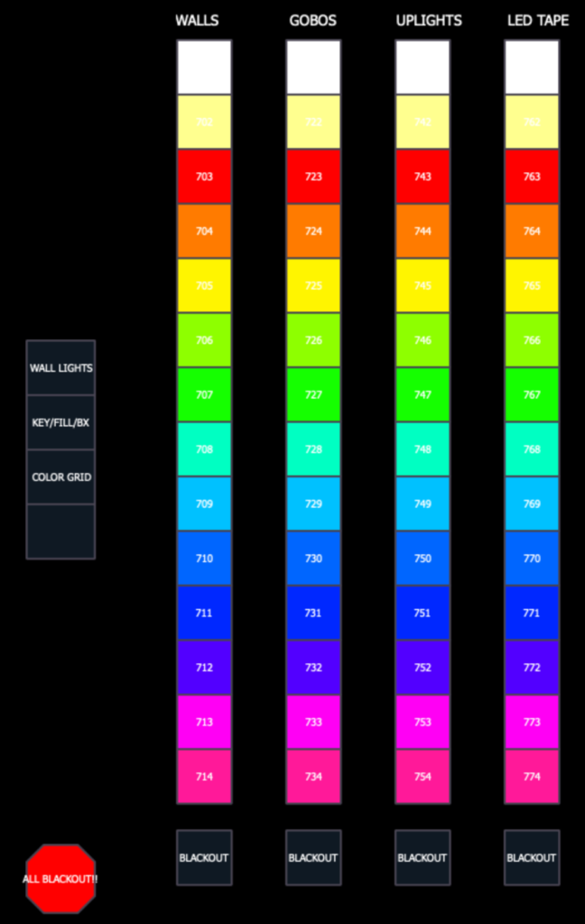
Each row obviously represents a system of lighting and is contained in separate cue lists. Each tile triggers a “Goto Cue X Time 2” macro. I choose to specify the timing in the macro to make a graceful transition if a client was watching while colors were auditioned, but also make sure to stay as unobtrusive as possible for the times a programmer was called in. Each cue list is Record and Solo Excluded and the Master is set to Intensity (though I hid all the cue lists on a higher fader page to avoid accidental button presses.)
To try to be as simple as possible, all the color cues were recorded with their systems at full. Since Full is frequently not the best thing for background lighting, I added four Inhibitive Submasters, one for each system so the DP could easily reduce things that blew out the camera. I sat with the DP for a while while they played with the interface and added a few of the things you see in the magic sheets in response to their requests. There is every chance that I will revise to suit as they spend more time in the template, but we all felt this was a good place to start from.
I was pleased with what this project made me think of in my own projects. An example: I honestly had never thought of recreating the color picker grid for EOS before and was very pleased by how easy it was. For busking, I would drop the timing from the trigger macros and set my GoTo time in Setup to Cue Timing, then create a series of macros that overwrote the cue stack timings and maybe have some offset options as well. I love how creative solutions for one project turn out useful for other purposes. What GUI interfaces have you made for clients and what have you all learned doing them? Hit me in the comments and thanks for reading.